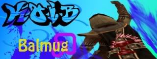
I recommend changing out the blue for brighter colors. Shades of Yellow, light neutrals, or grays would probably look awesome. It will make the character "pop". Keep the background brushes for texture. Then change "Balmug" to red, pulling color from the cape.
You are dealing with three neutral colors (blk,brn,gry) and one warm (red). Neutrals generally allow for little to no contrast. Focus on working with the red - which is why i think you chose the yellow - and it works with the brown too. Technically, it's Red and Green that are complementary colors, not red and blue, so try some shades of green too.
Play with the colors a bit. Consider filling KoiB letters...It might or might not work. Bring KoiB down a smidge toward the name. See what works and makes the important elements stand out. Yes, I have some background in graphic design...but swear I don't mean to sound like a know-it-all.

I have always liked this screenshot you used as an avatar of the cheering and the cape